CASE STUDY 1: GLOBE ISDP PSRA INTERNAL WEBSITE
Project Overview
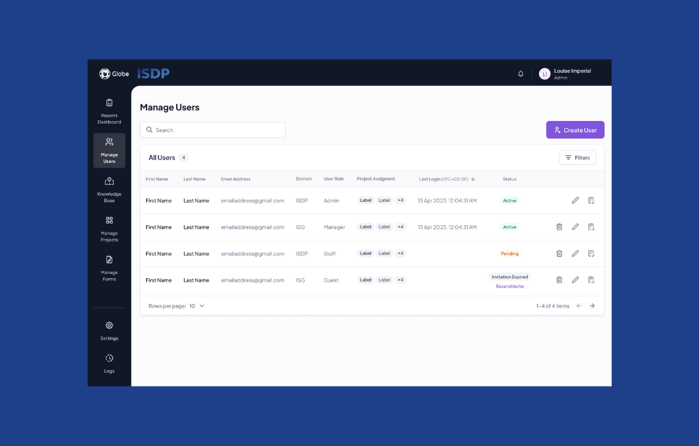
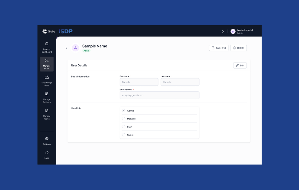
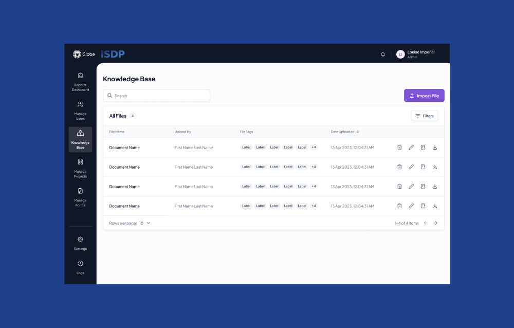
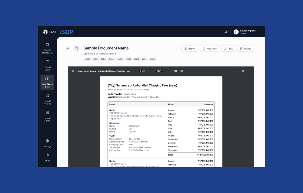
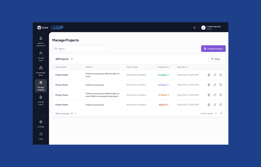
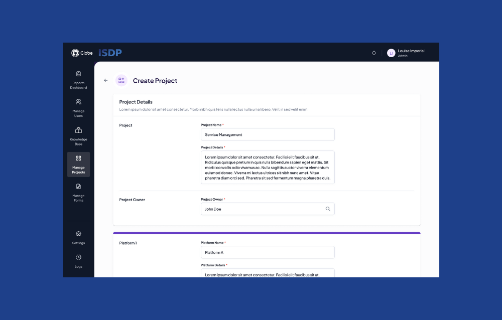
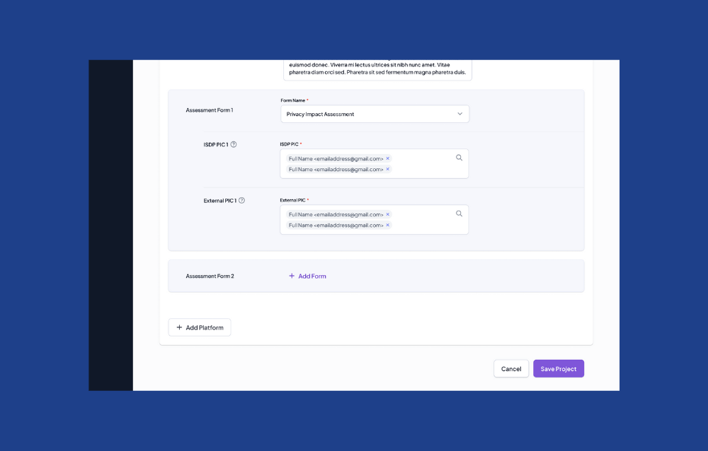
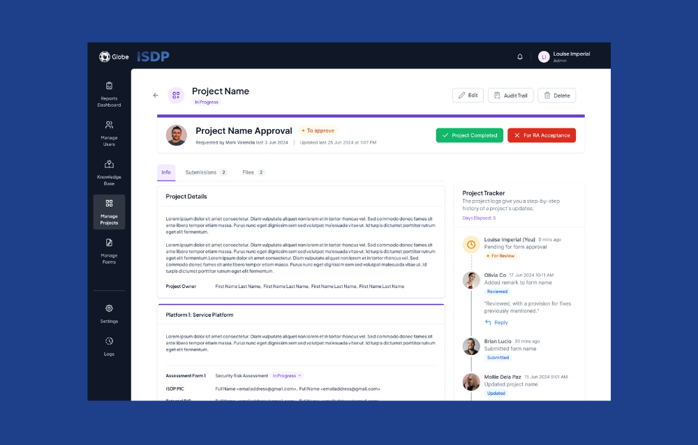
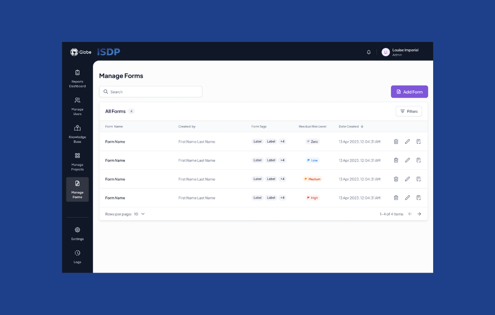
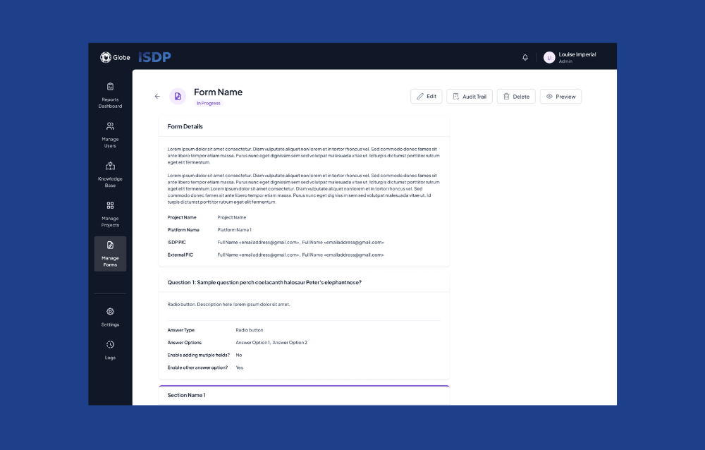
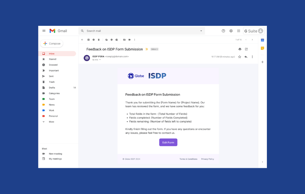
Design and implement a web application that standardizes and automates the Privacy and Security Risk Assessment (PSRA) process to safeguard Globe Telecom’s infrastructure, applications, and data. This project focuses on simplifying complex risk assessment workflows while ensuring usability, security, and efficiency. The platform handles user management, file management, project management, form submissions, and dashboard reporting.
Details
Client
Globe ISDP
Role
UI/UX Design Lead
Date
Mar 2024 – July 2024
Design Process
Step 1: Research & Discovery Phase
Goal: Understand user needs, pain points, and business goals. Analyze existing processes and identify opportunities for UI/UX improvements.
Key Steps:
Stakeholder Interviews: Worked closely with the Business Analyst to gather requirements from stakeholders, including privacy and security officers, IT administrators, and project managers.
Competitor & Similar Platform Research: Analyzed UI/UX patterns from similar platforms to ensure the design aligns with best practices. Focused on applications handling sensitive data, especially related to risk management and auditing.
Task Analysis: Broke down the current manual PSRA process into tasks, identifying bottlenecks and inefficiencies to streamline in the UI.
Step 2: Design Phase
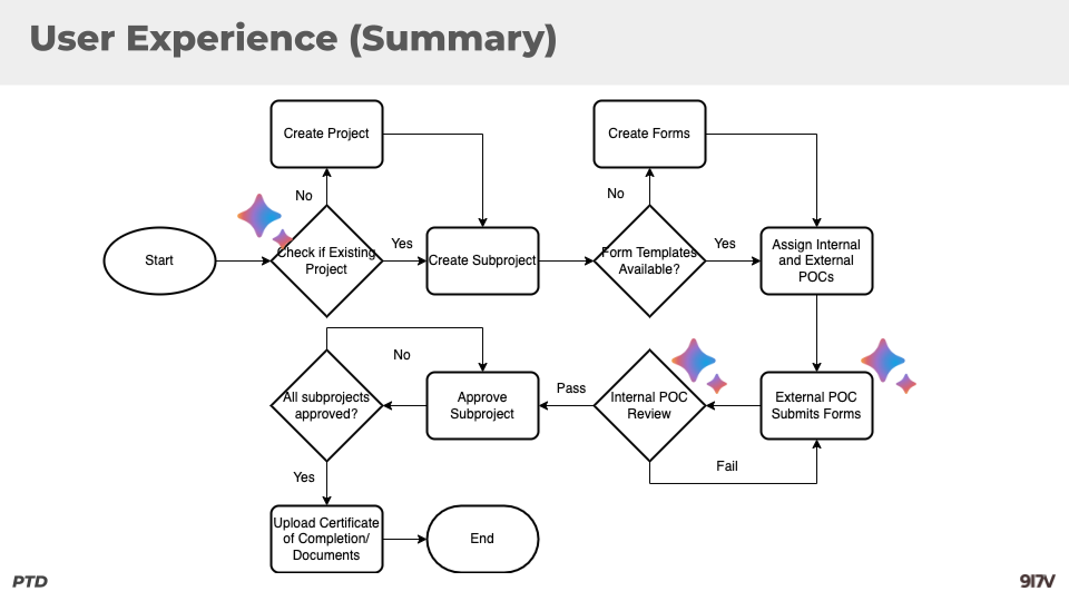
A. Defining User Flows
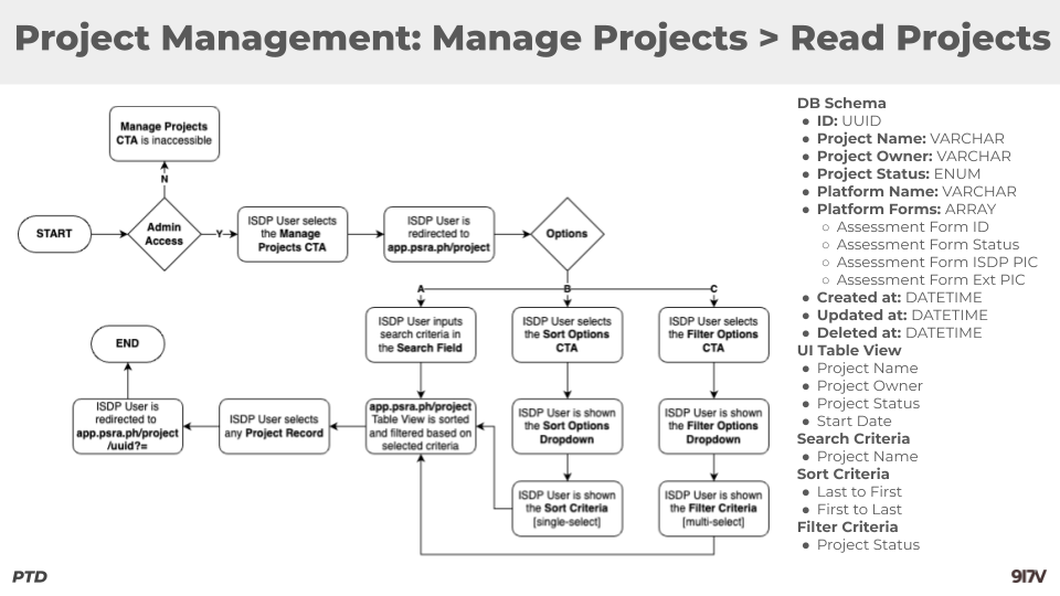
Goal: Map out user interactions across different modules (User Management, File Management, Project Management, Reports Dashboard, and Forms).
Collaboration with Business Analyst:
- Together, we defined critical user journeys (e.g., logging in via Google SSO, managing files and projects, and generating reports).
- Identified different user roles (e.g., Admins, Managers, Staff) and tailored flows to meet the needs of each role.
Key Deliverables:
- High-level user flow diagrams for each module (User Management, Project Management, and File Management).
- Edge cases identified (e.g., failed login attempts, email notification failures).
B. Wireframes (Low-Fidelity)
Goal: Create basic layouts to visualize the core structure and layout of the app without focusing on visual design.
Designed low-fidelity wireframes for key pages:
- Login and Onboarding: Google SSO integration, account creation (via email invite).
- Reports Dashboard: The primary post-login screen, showing a summary of ongoing projects, recent file uploads, and audit logs.
- User Management Interface: CRUD operations (Create, Read, Update, Delete) for user profiles, including advanced search, filters, and audit logs.
- Project Management Interface: Manage projects with CRUD functions, including detailed modals for project creation and feedback mechanisms.
- File Management Interface: Intuitive file operations, such as drag-and-drop for file uploads, audit trails, and import/export capabilities.
Key Considerations:
- Consistency: Ensured consistent layout and user flow across all modules.
- Accessibility: Prioritized readable typography and minimal use of colors to avoid confusion without custom CSS.
C. Interaction Design (Prototype)
Goal: Develop an interactive prototype to visualize form interactions and gather feedback before full development.
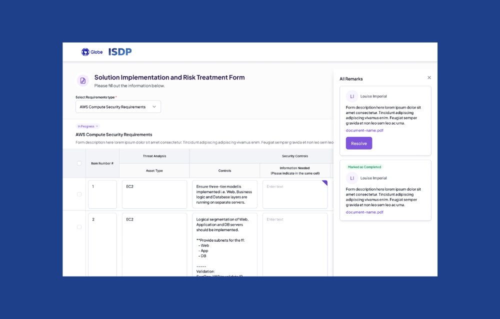
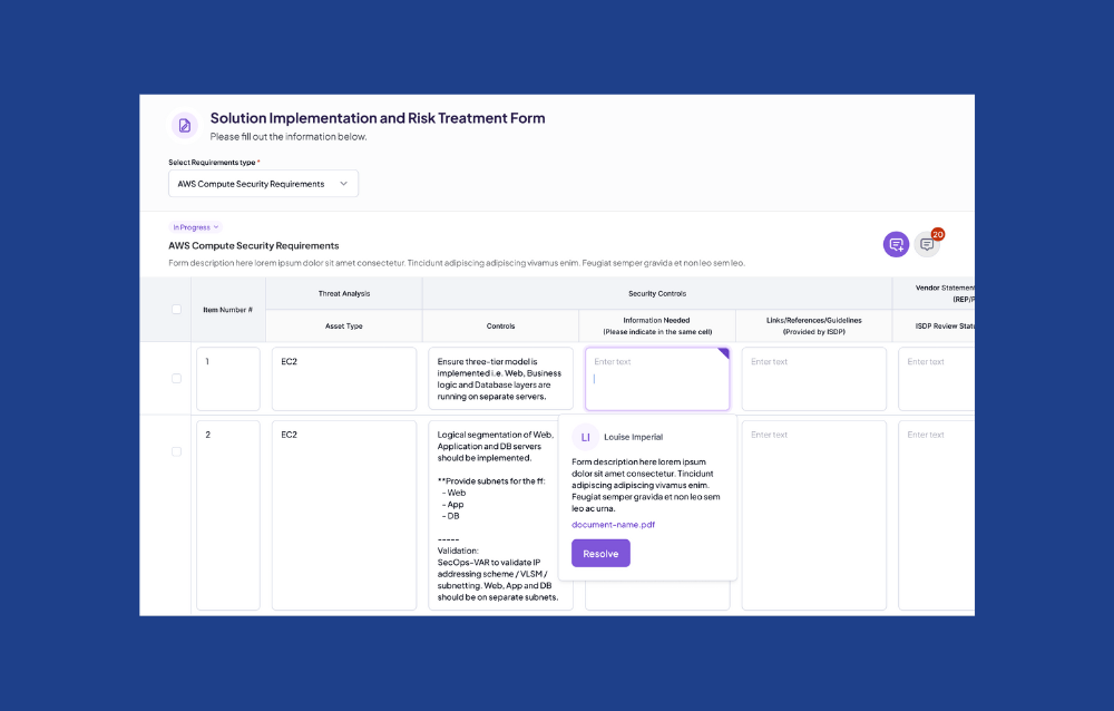
Focus Area: Table Form Interaction
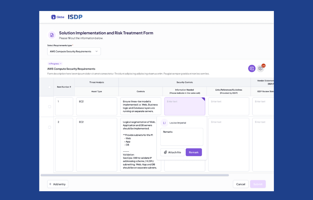
Created a prototype for the table form interaction, allowing users to input, edit, and review PSRA data directly within a structured table format. This included real-time validation for fields and easy tab navigation.
Testing:
- Internal Feedback: Worked with the Business Analyst and development team to review the prototype. Adjustments were made to improve the flow of entering data into complex forms and to ensure the responsiveness of table interactions.
- User Feedback: Collected feedback from stakeholders, refining based on ease of use and reducing clicks for frequent tasks (e.g., bulk editing capabilities for form submissions).
D. UI Design
Goal: Design a clean and intuitive interface that adheres to Globe’s design guidelines and UI/UX conventions, without relying on custom CSS.
Design Principles:
- Simplicity: Minimalist design for complex processes, ensuring ease of navigation.
- Clarity: Used card-based designs to segment different modules (projects, reports, users, etc.), keeping the interface uncluttered.
- Consistency: Followed Globe’s branding for typography, colors, and components while ensuring adherence to UI/UX standards across the app.


Step 3: Testing Phase
Goal: Ensure the app meets the needs of its users by conducting usability testing sessions.
Method:
- Moderated Testing: Worked with a small group of users, including PSRA officers and IT staff, to navigate key features of the prototype.
- Scenario-Based Tasks: Users were asked to complete tasks such as creating a new project, uploading files, and viewing audit trails.”
Key Findings:
- Users appreciated the simplified project request workflow and dashboard summaries but requested quicker access to frequently used reports.
- Minor issues with file handling modals were identified, especially for bulk file uploads.
Step 4: Iteration & Development Phase
Goal: Refine the design based on feedback and collaborate closely with the development team.
Approach:
- Made adjustments to the user flow, particularly on the dashboard for easier access to critical information.
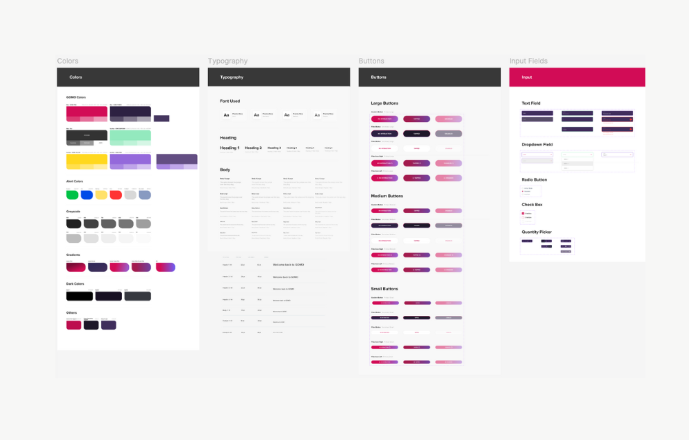
- Provided developers with a comprehensive design system including components (buttons, forms, modals, etc.) for faster and more consistent implementation.
- Conducted regular design reviews with developers to ensure adherence to the UI/UX vision during implementation.
Design Execution

The design execution for the Globe ISDP PSRA project involved a user-centered approach, beginning with thorough research and stakeholder interviews to define user needs and workflows. Collaborating closely with the Business Analyst, we created detailed user flows that guided the development of low-fidelity wireframes and interactive prototypes, emphasizing usability across key modules such as user management, project management, and file management. The design adhered to Globe’s branding and UI/UX standards, ensuring consistency and clarity without custom CSS. Through iterative testing and feedback sessions, we refined the interface to enhance user interactions and streamline critical processes, ultimately delivering a comprehensive web application that standardizes and automates the Privacy and Security Risk Assessment process effectively.
CASE STUDY 2: GOMO Fiber (Under Globe Telecom)
Project Overview
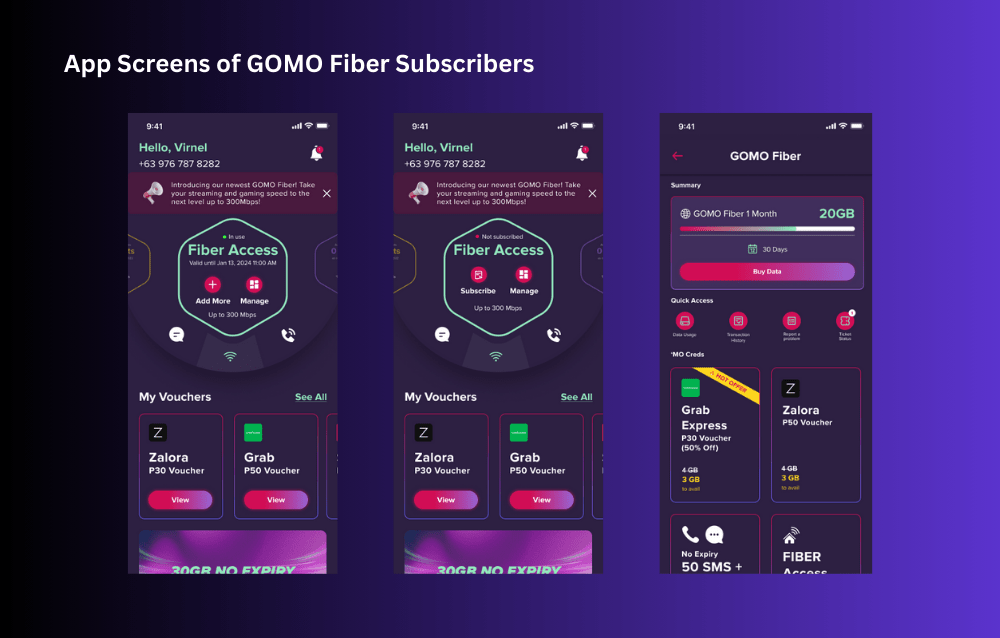
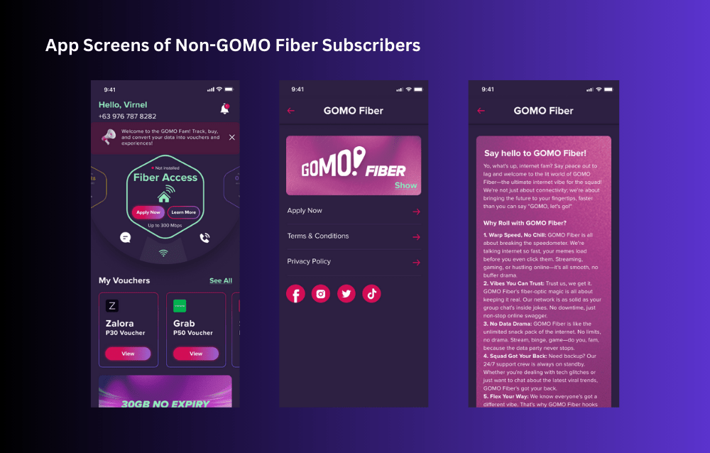
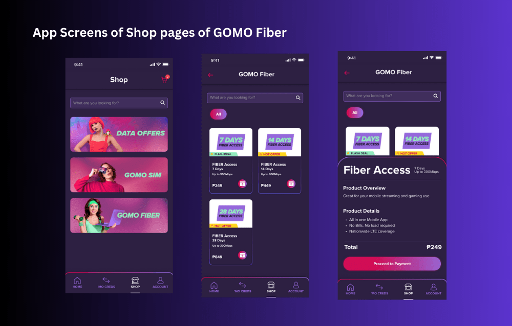
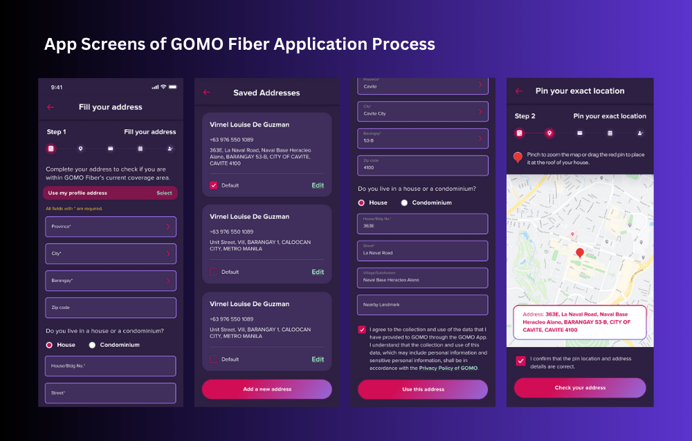
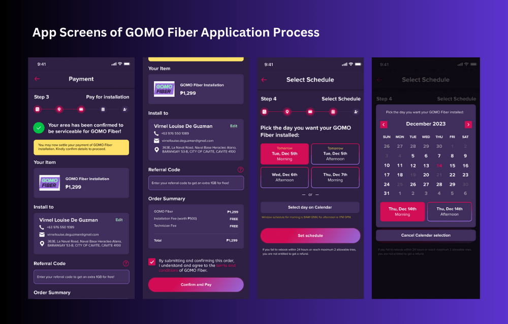
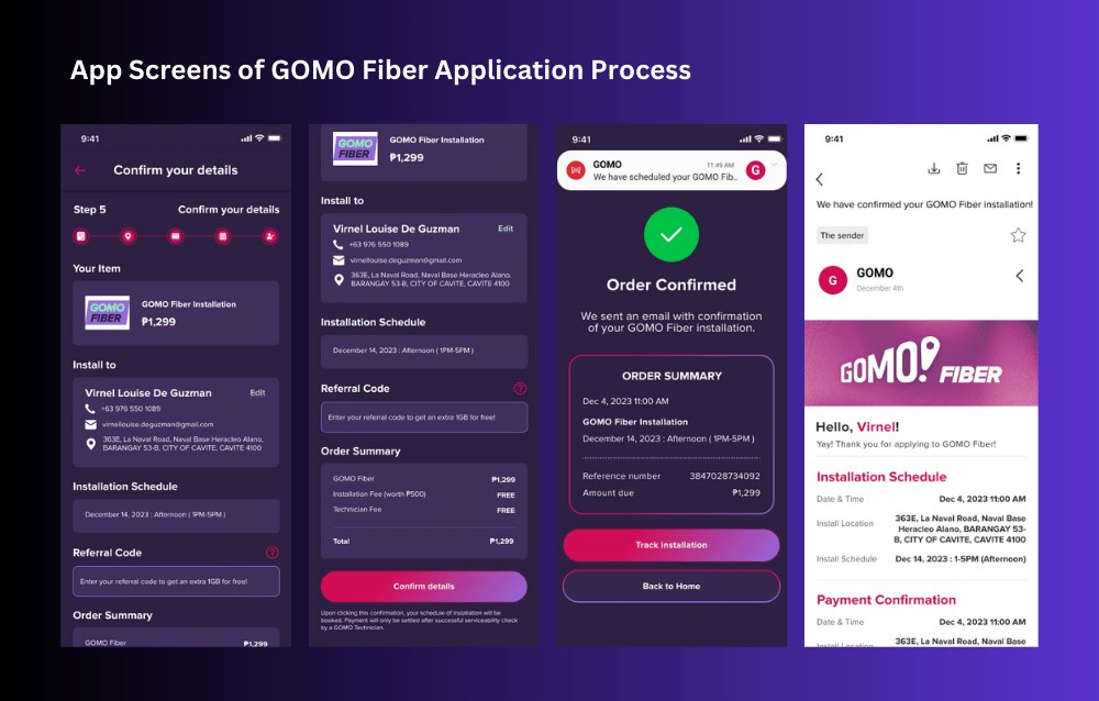
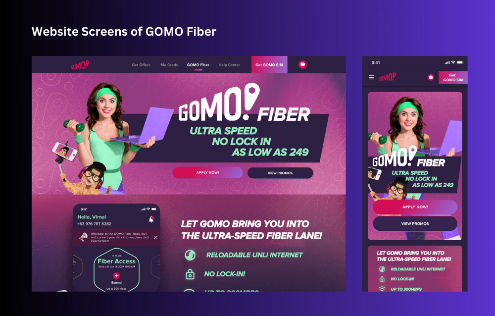
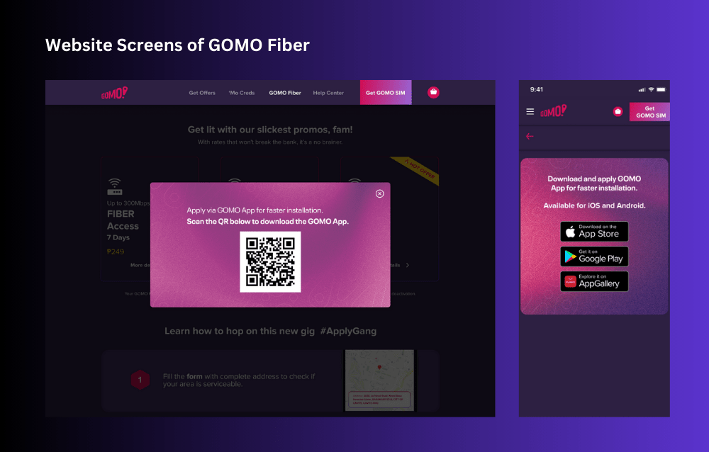
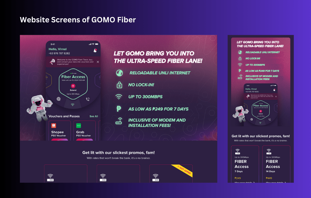
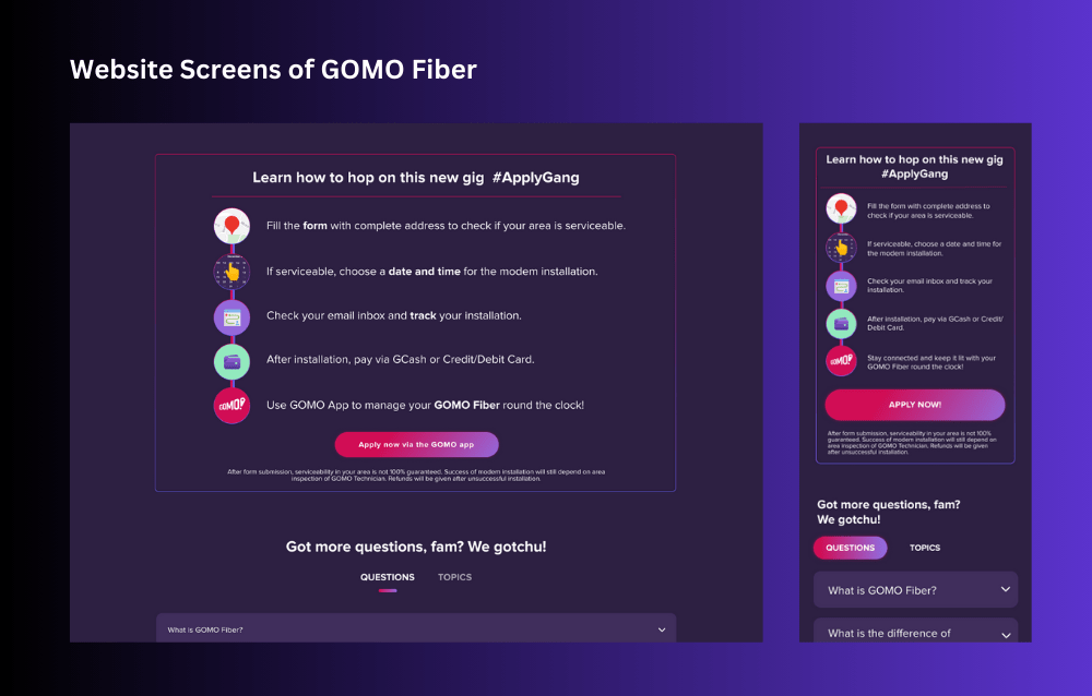
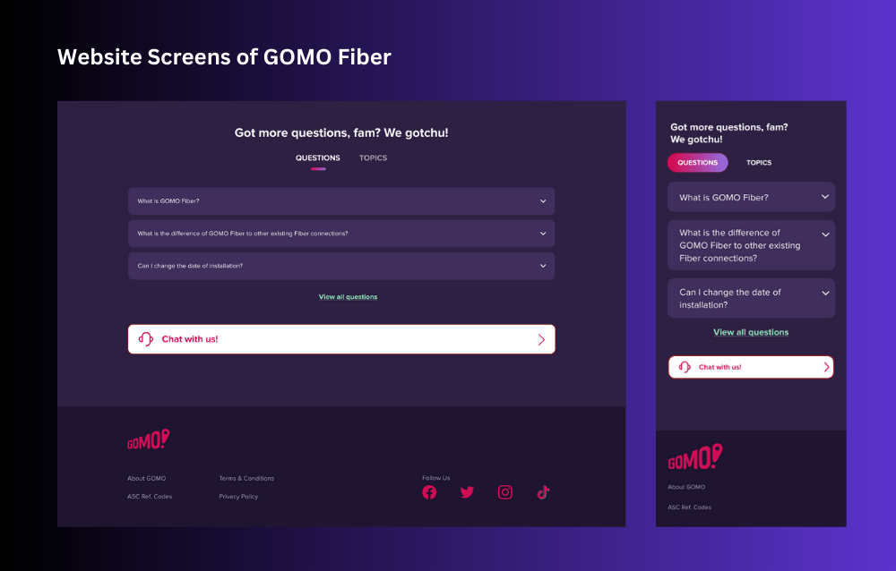
The GOMO Fiber project aimed to revolutionize the home internet experience by introducing a new fiber internet service under the GOMO brand. GOMO Fiber is designed to offer high-speed, reliable internet connectivity to households, enhancing digital experiences for work, entertainment, and everyday online activities. The project included the development of a comprehensive mobile application and a streamlined website to provide users with seamless access to GOMO Fiber’s services and features.
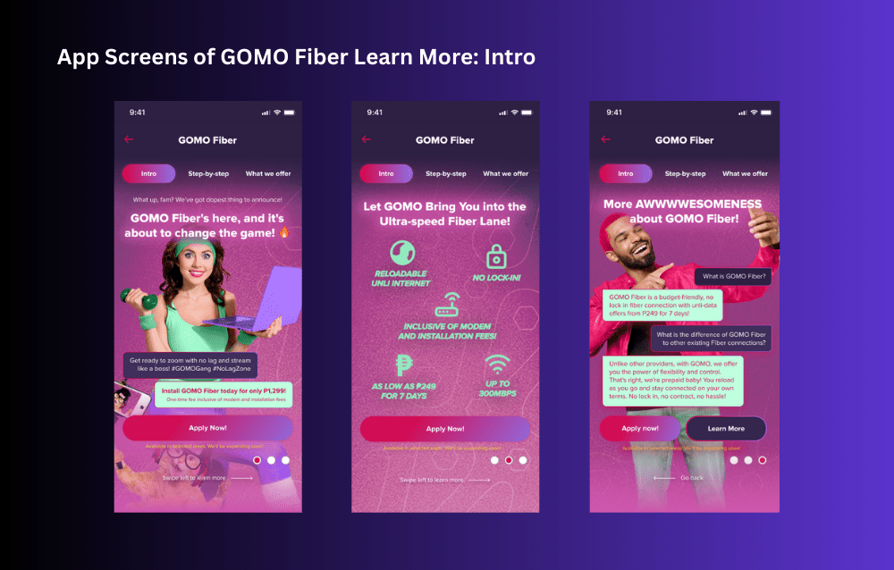
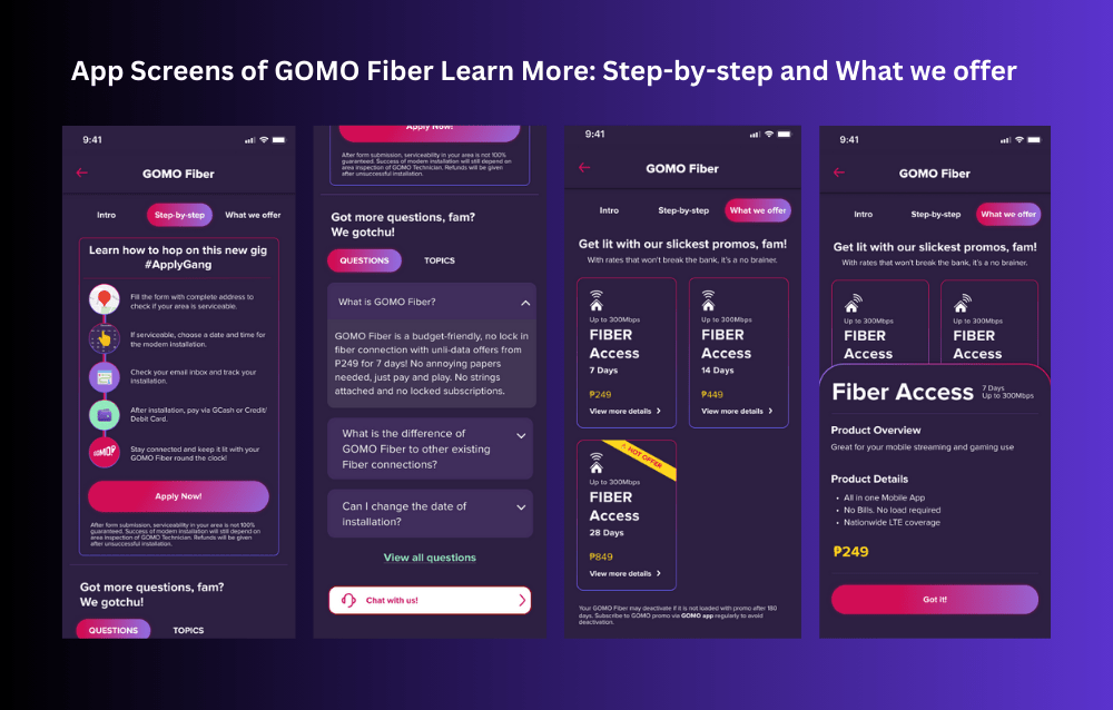
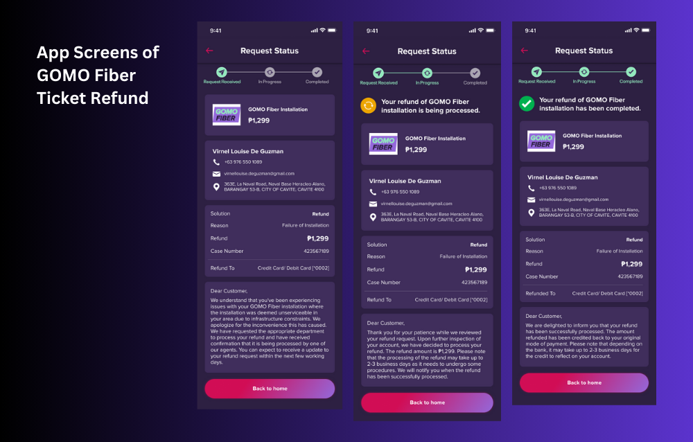
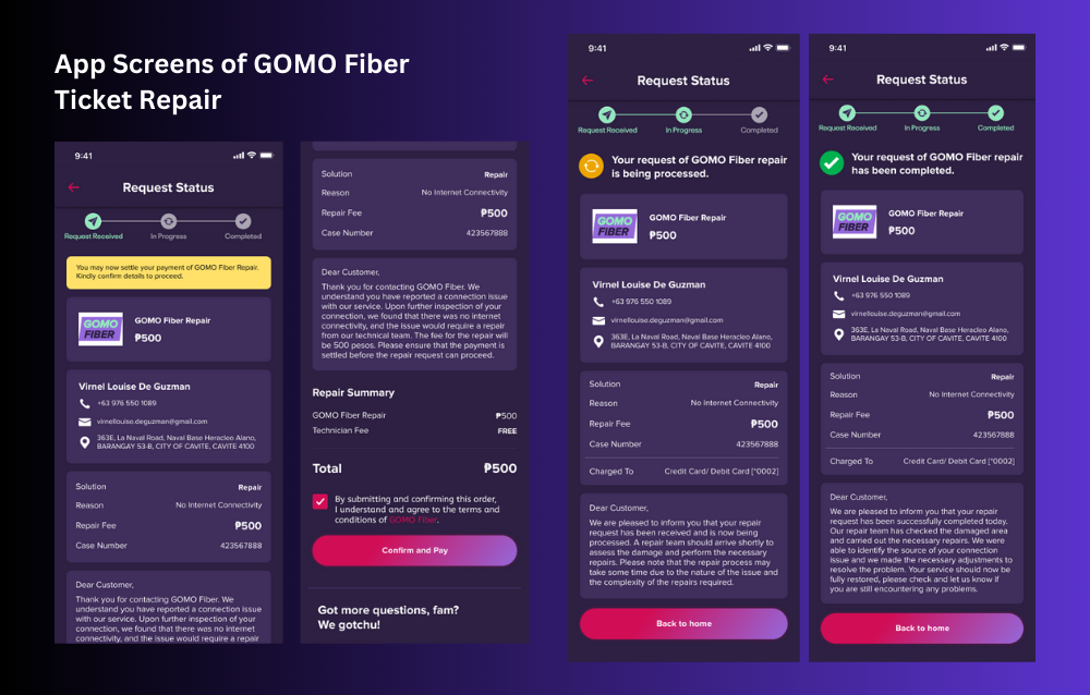
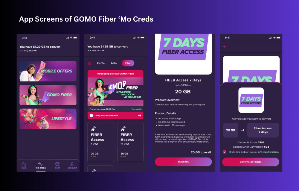
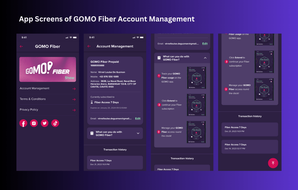
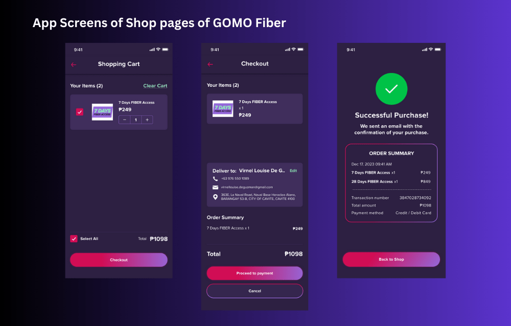
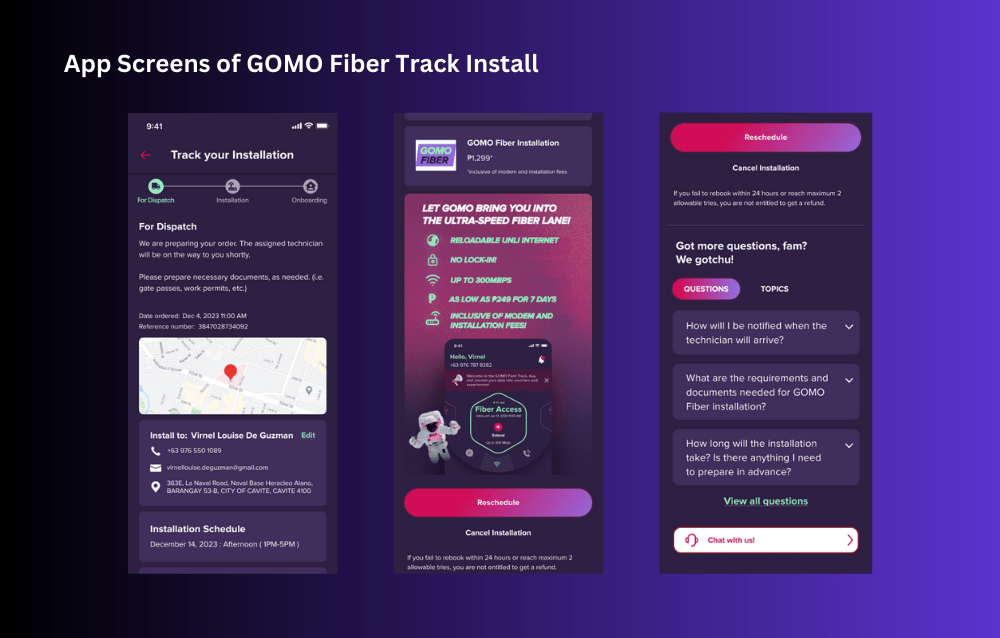
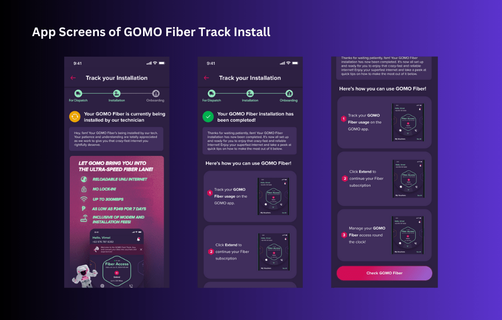
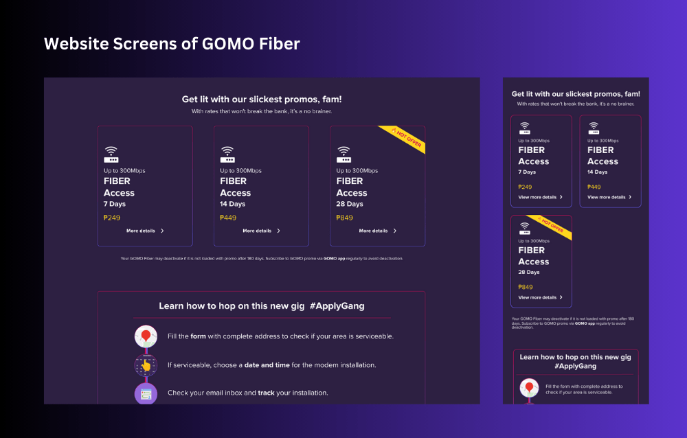
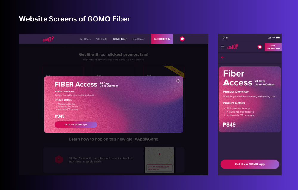
The primary goal was to create an intuitive, user-friendly platform that would simplify the application process, offer detailed product information, and facilitate efficient account management. The project encompassed various features, including the GOMO Fiber application process, Learn More sections, Shop interface, ‘Mo Creds management, Product Cards, Account Management tools, and Ticket Flow for support.
Details
Client
GOMO (Under Globe Telecom)
Role
UI/UX Design Lead
Date
Oct 2023 – Dec 2023
Design Process
Step 1: Research Phase
- User Research and Interviews: Conducted in-depth interviews with potential users to understand their needs, preferences, and pain points related to home internet services.
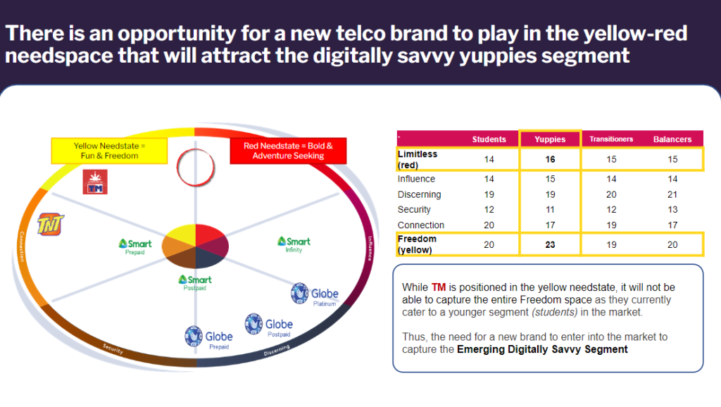
- Competitive Analysis: Analyzed competitor products and services to identify market gaps and opportunities for differentiation.
- Market Analysis: Examined market trends and user behavior to inform design decisions.
- Stakeholder Interviews: Engaged with stakeholders to align business goals and technical feasibility.
Step 2: Design Phase
- Information Architecture: Structured the content to ensure logical flow and easy navigation.
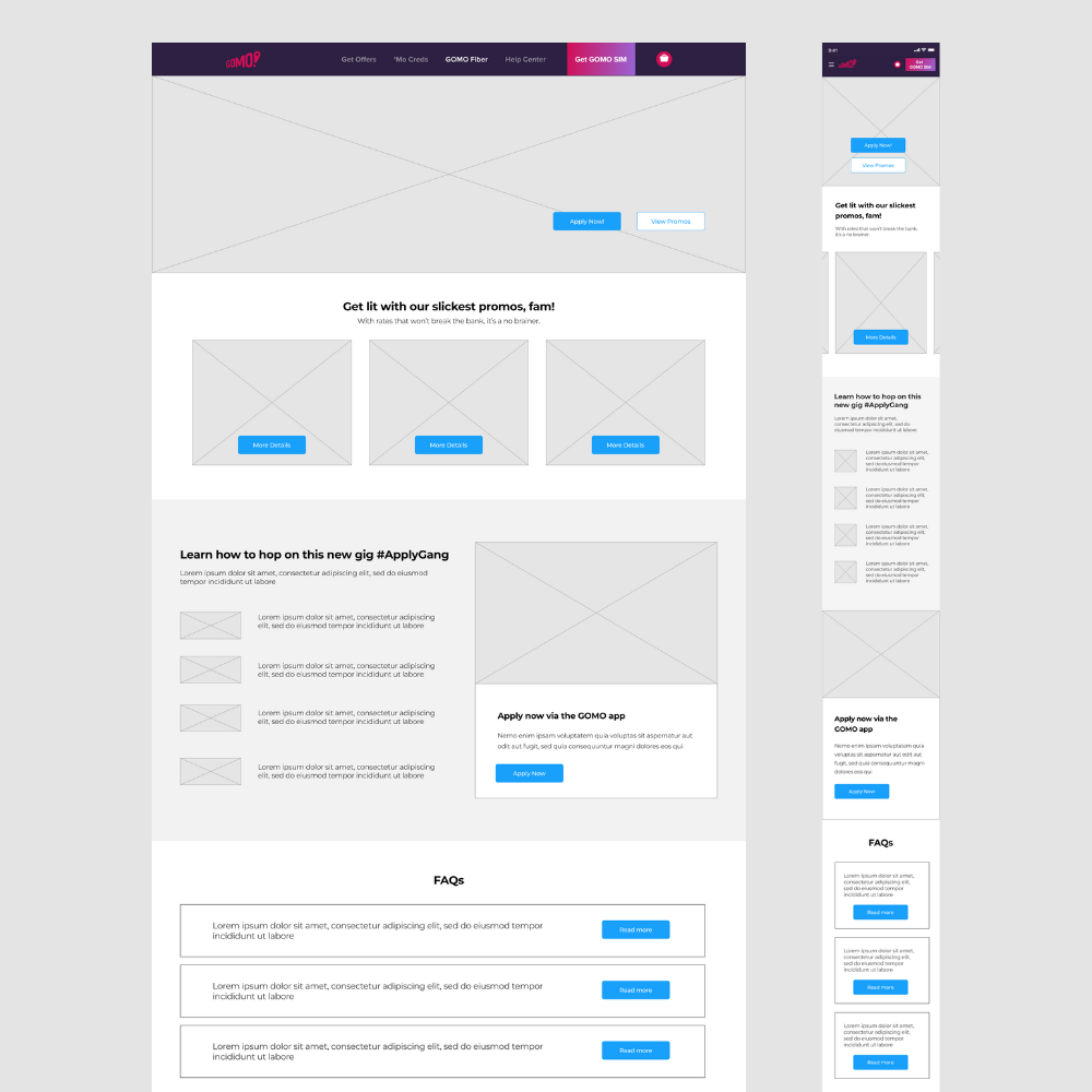
- Low Fidelity Wireframes: Created basic wireframes to outline the overall layout and structure.
- High Fidelity Wireframes: Developed detailed wireframes incorporating branding elements and visual aesthetics.
- Prototyping: Built interactive prototypes to simulate user interactions and gather feedback.
- Visual Design: Crafted a visually appealing and modern design that aligns with the GOMO brand identity.
Step 3: Testing Phase
- Usability Testing: Collaborated with the developers to conduct usability tests to identify and address potential user experience issues.
- A/B Testing: Collaborated with the developers to conduct A/B tests to compare design variations and optimize user experience based on data-driven insights.
- Accessibility Testing: Ensured the design was accessible to all users, including those with disabilities.
- Performance Testing: Optimized the design for fast loading times and smooth performance.
Step 4: Implementation Phase
- Development Handoff: Provided detailed design specifications to the development team. Collaborated with developers to ensure accurate implementation of the design.
- Quality Assurance: Conducted thorough testing with the team to identify and fix any issues before launch.
- Deployment: New application and website not yet launched to the public.
Design Execution
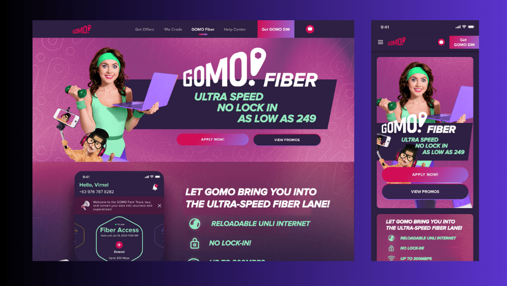
As a Senior UI/UX Designer at Globe Telecom, my contributions were instrumental in enhancing the user experience and adding new features to the GOMO mobile application and website, particularly for the new GOMO Fiber product. Key contributions included:
- GOMO Fiber Application Process: Designed an intuitive application process that streamlined user onboarding and increased conversion rates.
- Learn More Sections: Created informative and engaging sections to educate users about GOMO Fiber’s benefits and features.
- Shop Interface: Developed a user-friendly shop interface that simplified the purchasing process.
- ‘Mo Creds Management: Designed tools for users to manage their ‘Mo Creds efficiently.
- Product Cards: Developed visually appealing product cards to showcase GOMO Fiber plans and options.
- Account Management Tools: Created comprehensive account management tools for easy user interaction with their accounts.
- Ticket Flow: Designed a seamless support ticket flow to enhance customer service and issue resolution.
CASE STUDY 3: REIMAGINED GLOBE FIBER
Project Overview
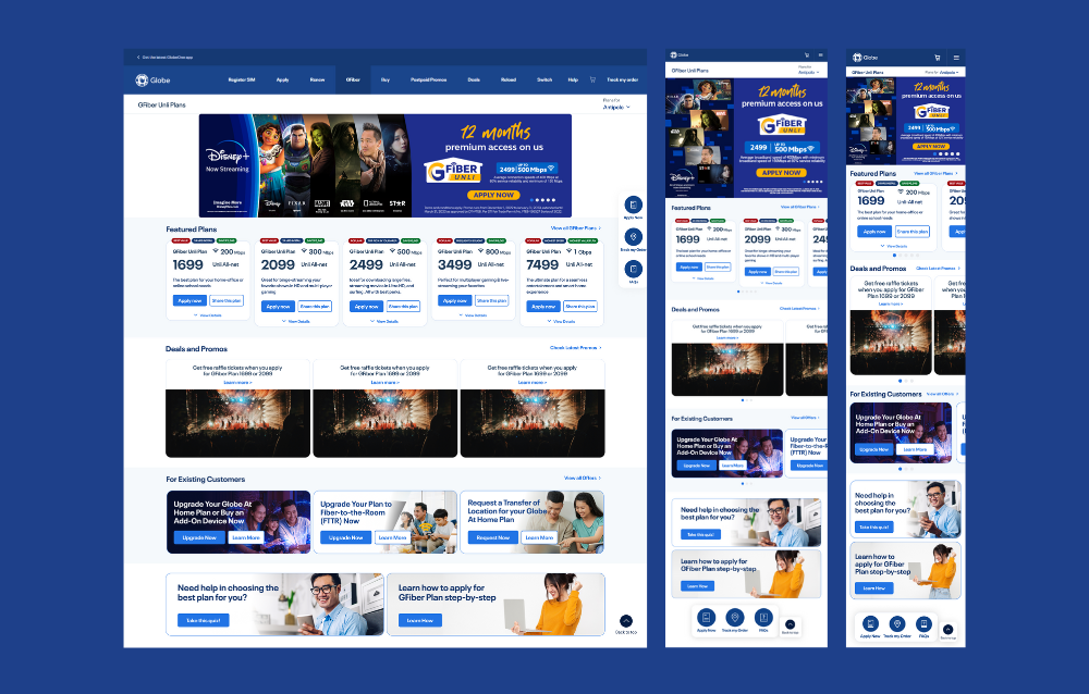
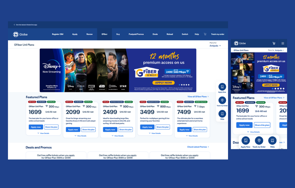
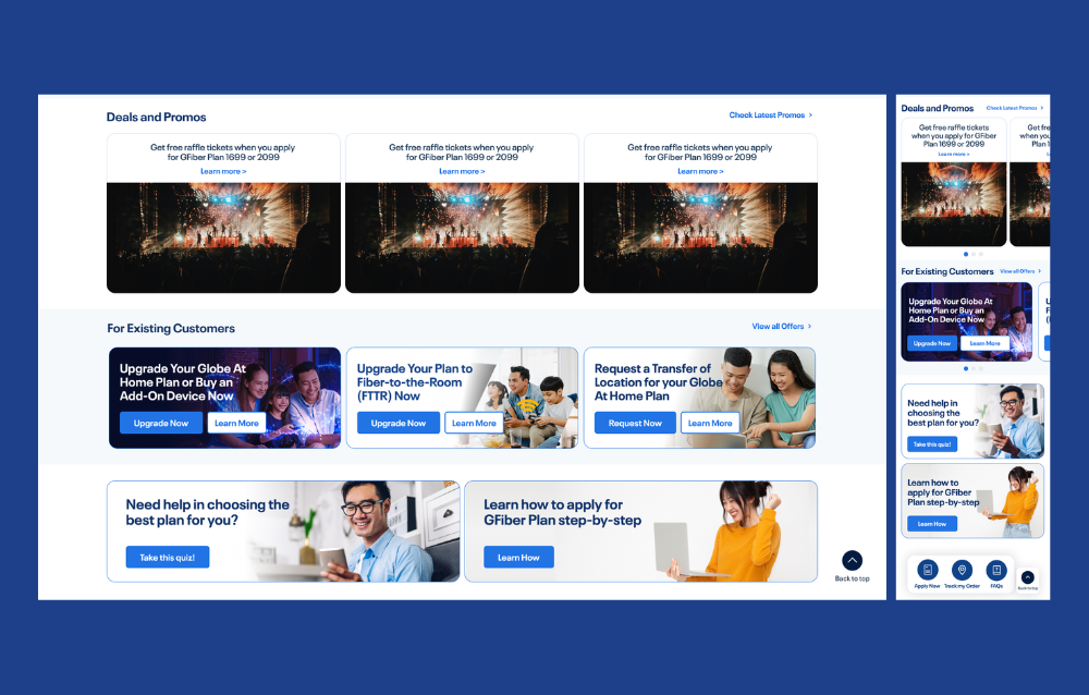
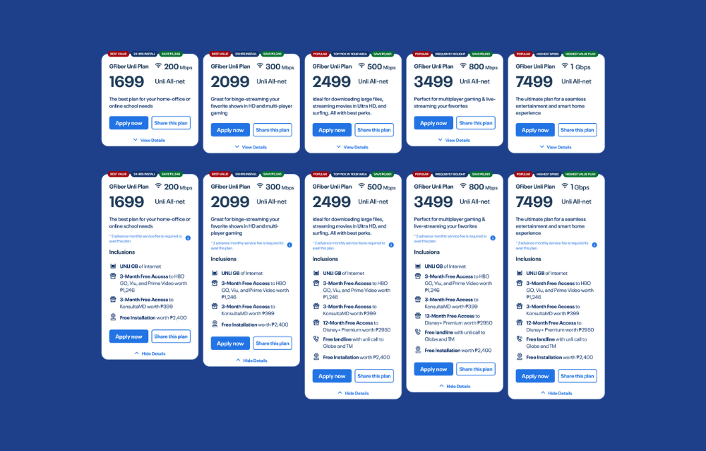
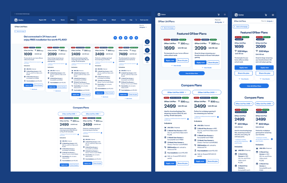
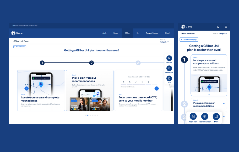
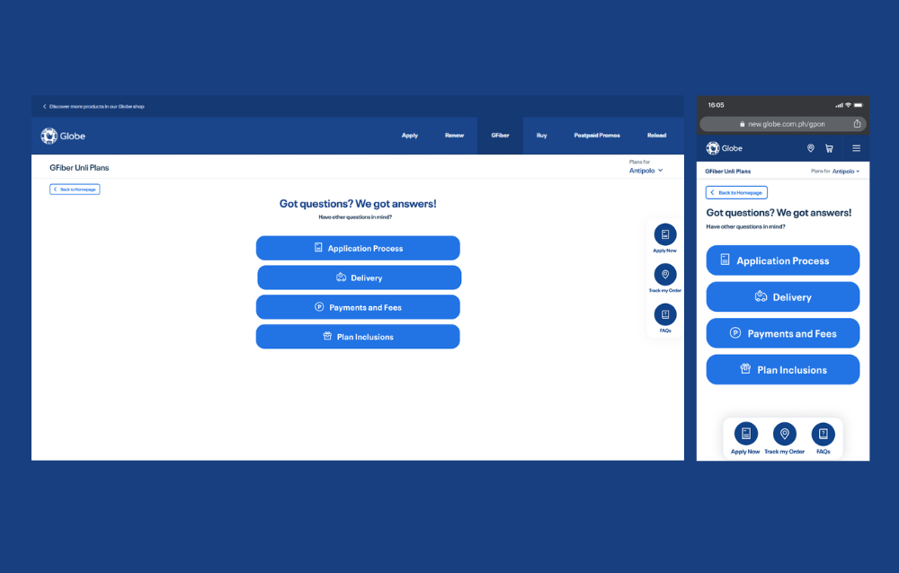
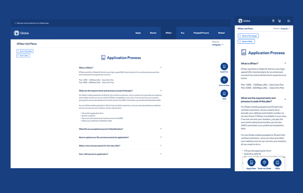
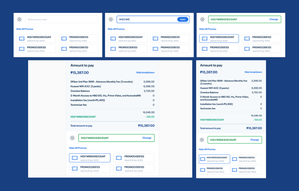
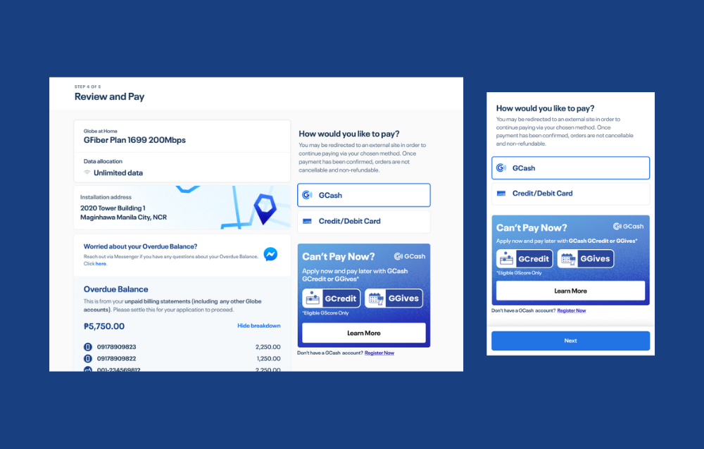
The Globe Fiber website was reimagined to address a significant number of user fallouts on the lower portions of the pages. The original site for Globe Telecom’s postpaid fiber service was overly long, leading to decreased user engagement. The revamped design focuses on creating a shorter, more compressed layout, just one and a half folds long, to enhance user experience and increase conversion rates.
Globe Telecom launched its postpaid fiber internet service aimed at the mass market, prioritizing Class C, D, and E segments, with secondary focus on Class A and B. Applications are streamlined through the GlobeOne app, and installation fees can be managed via GCash, GGives, and GCredit. The service is marketed as an affordable solution for work, education, and online business, with nationwide availability depending on serviceability.
Details
Client
Globe Telecom
Role
UI/UX Design Lead – Postpaid
Date
Nov 2022 – July 2023
Design Process
Step 1: Research Phase
- User Research and Interviews: Conducted in-depth interviews with the target market, focusing on their internet usage, pain points, and preferences.
- Competitive and Market Analysis: Analyzed competitor websites and market trends to identify best practices and opportunities for differentiation.
- Stakeholder Interviews: Engaged with stakeholders to understand business goals and technical constraints.
Step 2: Design Phase
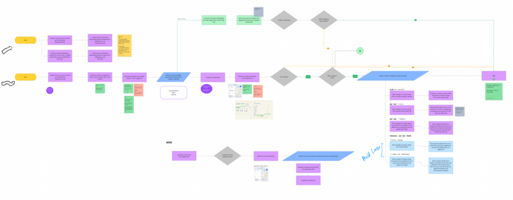
- Information Architecture: Structured the content to ensure a logical flow and easy navigation.
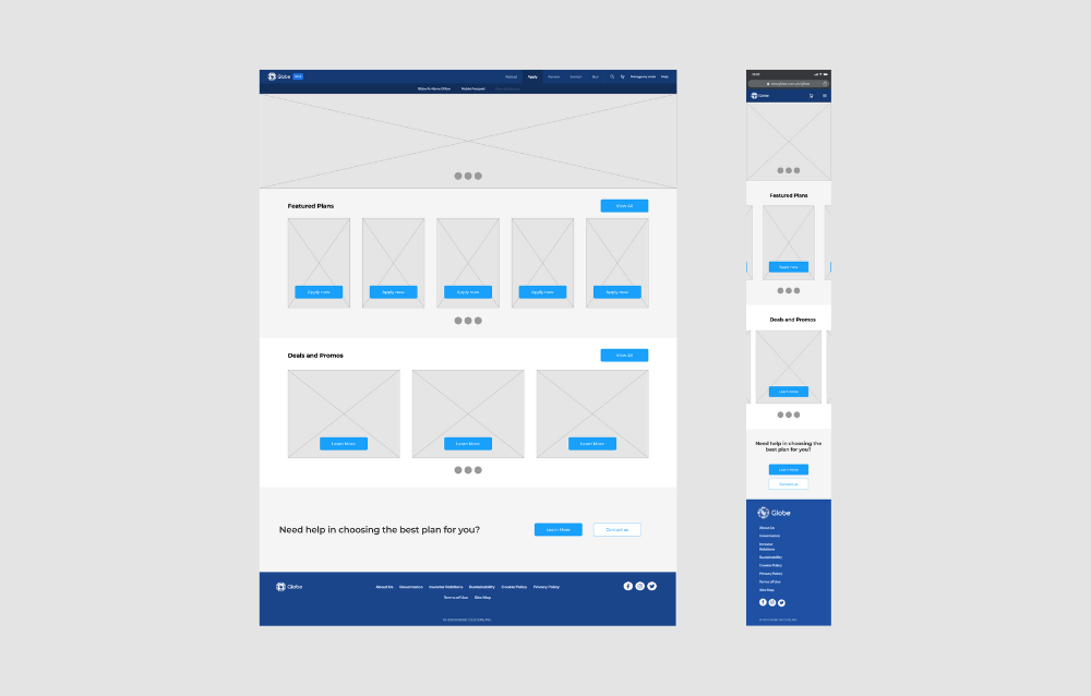
- Low Fidelity Wireframes: Created basic wireframes to outline the layout and structure.
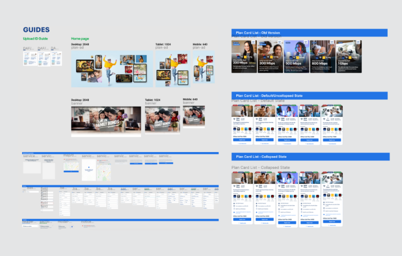
- High Fidelity Wireframes: Developed detailed wireframes incorporating design elements and branding.
- Prototyping: Built interactive prototypes to simulate user interactions and gather feedback.
- Visual Design: Crafted the final visual design, focusing on a clean, modern aesthetic of Globe Postpaid Fiber.

Step 3: Testing Phase
- Usability Testing: Collaborated with the developers to test the design with real users to identify and fix usability issues.
- A/B Testing: Collaborated with the developers to conduct A/B tests to compare design variations and optimize user experience based on data-driven insights.
- Accessibility Testing: Ensured the design was accessible to all users, including those with disabilities.
- Performance Testing: Optimized the design for fast loading times and smooth performance.
Step 4: Implementation Phase
- Development Handoff: Provided detailed design specifications to the development team. Collaborated with developers to ensure accurate implementation of the design.
- Quality Assurance: Conducted thorough testing with the team to identify and fix any issues before launch.
- Deployment: Launched the new website to the public.
Step 5: Evaluation Phase
- Analytics and Metrics: Monitored key performance indicators (KPIs) such as user engagement, conversion rates, and bounce rates.
- User Feedback: Collected feedback from users to identify areas for improvement.
- Iteration and Improvement: Continuously refined the design based on analytics and user feedback.
Design Execution

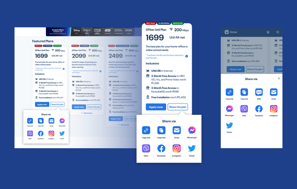
Tasked with reimagining the entire Globe Fiber landing page and inner pages, I created wireframes, design studies, and high-fidelity designs. The design process was iterative, involving regular peer reviews and feedback from both junior and senior designers, as well as stakeholders. The final designs were presented to and approved by the Head of Globe’s Digital Growth Team. Ongoing collaboration with Globe Telecom’s web developers ensured the successful implementation of the approved UI designs.
User Testing and Feedback
User testing involved a diverse group of Globe Fiber users from the target market. Key findings included:
- Engagement: There was a 2,040% increase in user engagement, measured by the time spent on the site and the number of pages visited.
- Conversion Rate: The conversion rate for fiber plan sign-ups increased by 600% post-launch.
User Comments:
- “It is so much cleaner and easier to use.”
- “I can find the information I need quickly without scrolling through endless pages.”
- “The application process is straightforward, and the payment options are very convenient.”
Conclusion
The reimagined Globe Fiber website successfully addresses the issues of user fallouts and lengthy page content. The streamlined, one-and-a-half-fold design enhances user experience, driving higher engagement and conversion rates. Through a comprehensive design process, continuous user testing, and close collaboration with developers, the new website delivers a more efficient and user-friendly experience for Globe Telecom’s diverse customer base.
CASE STUDY 4: SAGIPCAVITECITY (THESIS)
Project Overview
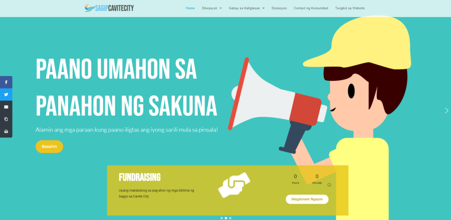
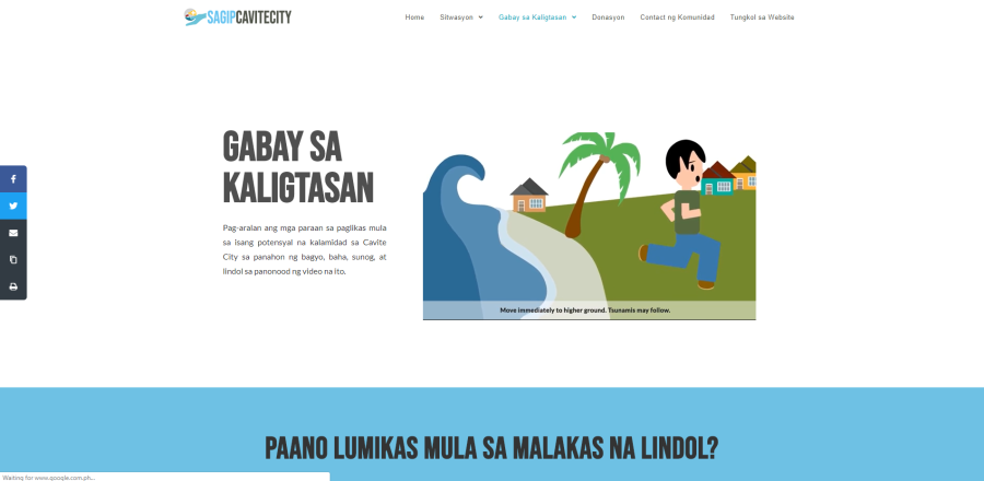
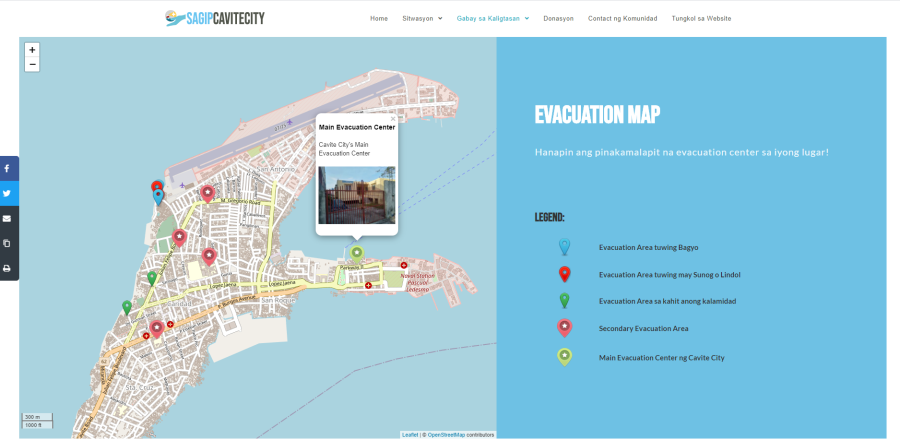
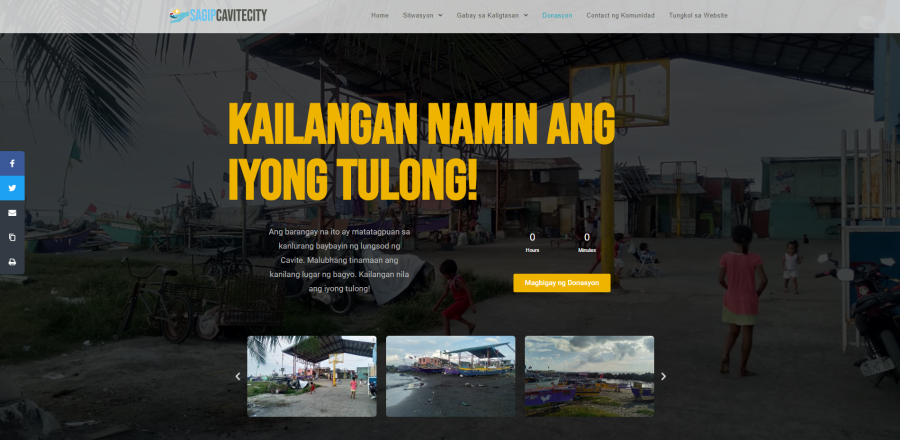
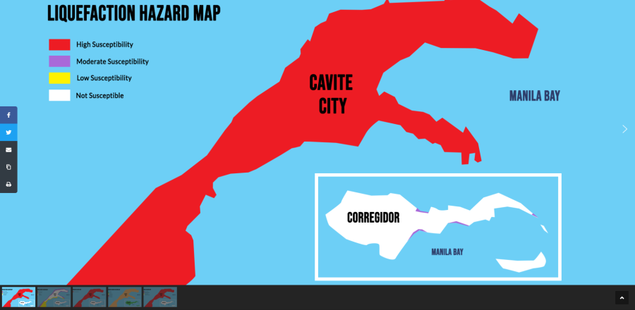
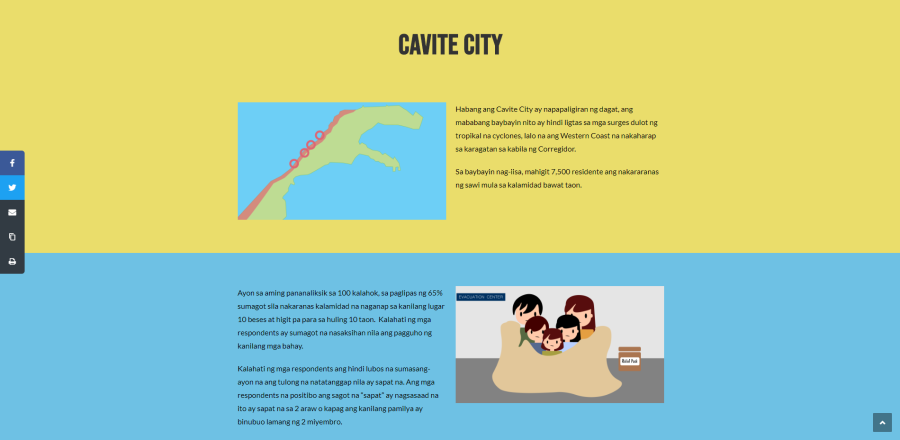
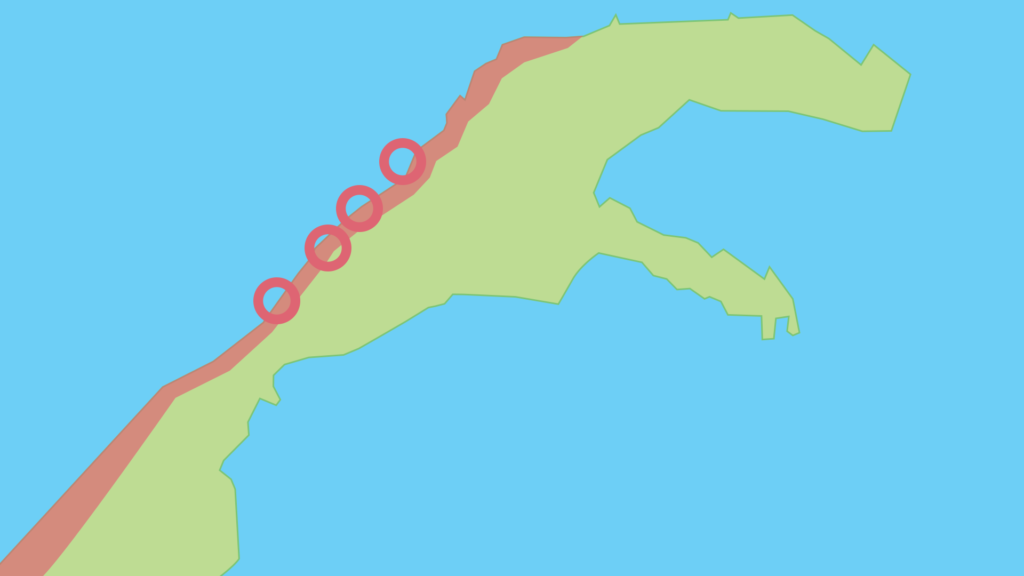
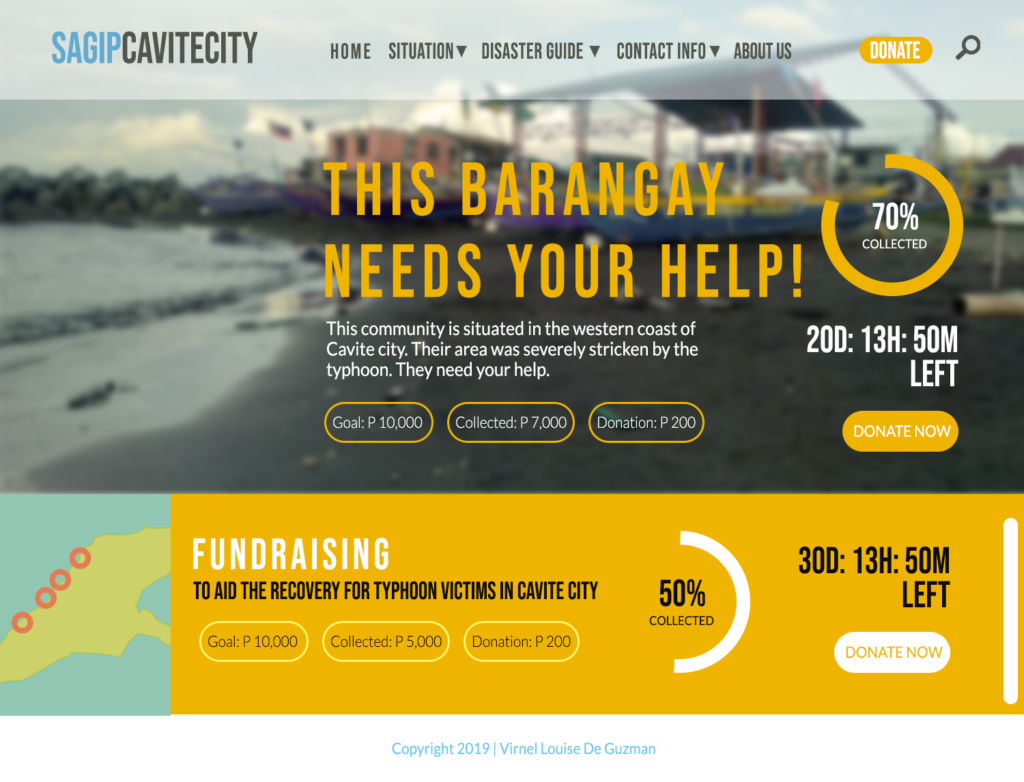
SagipCaviteCity is a web infographic video feature designed to shed light on the challenging conditions in the western coastal community of Cavite City, Philippines. The project aims to enhance the disaster preparedness and response of residents aged 25 and above by providing comprehensive information on humanitarian aid and evacuation processes. This initiative focuses on improving the community’s resilience against frequent natural disasters such as flooding, strong winds, and sea waves.
More info
Client
CDRRMO-Cavite City
Role
UI/UX designer, Web developer
Date
April 2020
Problem statement
The western coastal area of Cavite City is highly susceptible to natural disasters, necessitating frequent evacuations due to severe flooding and structural damage. The primary challenge lies in enhancing the local community’s disaster response capabilities to reduce casualties and mitigate damage. To address this, SagipCaviteCity aims to provide an accessible online disaster guide that offers practical evacuation instructions and relief assistance information.
Objectives
- Identify Evacuation Problems: Understand the specific evacuation challenges faced by residents in the disaster-affected areas of Cavite City.
- Relief Assistance Processes: Clarify the procedures for accessing relief aid from both government and non-governmental organizations.
- Provide Practical Information: Equip remote, disaster-prone communities with effective evacuation guides tailored to common disaster scenarios.
Infographic Video Features
- Evacuation Challenges:
An in-depth look at the evacuation issues faced by coastal residents, emphasizing the need for timely and efficient evacuation procedures. - Accessing Relief Aid:
Step-by-step guidance on how residents can avail themselves of relief assistance from various aid programs. - Disaster Response Guide:
Practical tips and instructions for safe evacuation during common types of natural disasters, tailored specifically for the Cavite City community.
Design Process
The design journey of SagipCaviteCity involved several key phases:
Step 1: Research Phase
- User Research and Interviews: Conducted in-depth interviews with the target users, focusing on their internet usage, pain points, and preferences.
- Stakeholder Interviews: Engaged with barangay officials and City Disaster Risk Reduction & Management Office (CDRRMO-Cavite City) to understand their disaster response program goals and technical constraints.
Step 2: Design phase
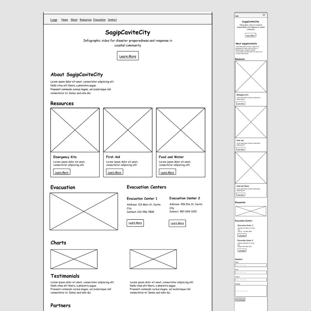
- Information Architecture: Developed a sitemap to organize the content structure logically. Created user flows and process flows to ensure intuitive navigation through new feature screens.
- Low Fidelity Wireframes and High Fidelity Wireframes: Conducted multiple design studies to explore various visual and functional approaches.
Also produced detailed storyboards to plan the three core infographic videos.
- Prototyping: Built interactive prototypes to simulate user interactions and gather feedback. Focused on creating clear, engaging, and informative infographic videos to communicate critical disaster response and evacuation information.
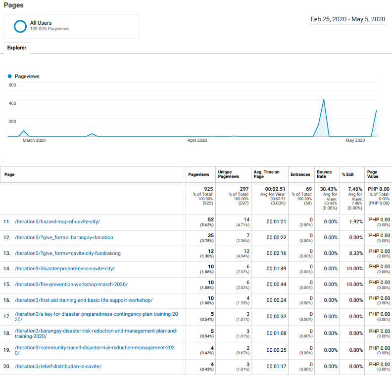
Google Analytics
STEP 3: User Testing and Feedback
Usability testing was conducted with 100 residents from the western coastal community of Cavite City. The testing aimed to evaluate the usability, clarity, and effectiveness of the SagipCaviteCity website and its infographic videos.
Key Findings
- Ease of Use: 87% of users found the website easy to navigate.
- Clarity of Information: 92% of users reported that the information provided was clear and easy to understand.
- Effectiveness of Infographic Videos: 89% of users felt that the infographic videos significantly enhanced their understanding of evacuation procedures.
- Overall Satisfaction: 94% of users expressed overall satisfaction with the SagipCaviteCity platform.
USER COMMENTS
- “The step-by-step guides were very helpful and easy to follow.”
- “The videos made it clear what to do during different types of disasters.”
- “I feel more prepared now than I did before using the website.”
User Research Interviews
To gain deeper insights, interviews were conducted with five barangay officials from the disaster-stricken areas and one disaster response official responsible for evacuation operations in Cavite City.
Barangay Officials' Insights
Barangay Official 1:
- Highlighted the frequent communication breakdowns during evacuations.
- Appreciated the detailed contact information provided in the SagipCaviteCity guide.
Barangay Official 2:
- Mentioned the challenge of evacuating elderly and disabled residents.
- Found the practical evacuation tips for these groups very useful.
Barangay Official 3:
- Pointed out the lack of awareness about relief assistance processes.
- Valued the clear instructions on accessing aid from various programs.
Barangay Official 4:
- Emphasized the importance of timely evacuation.
- Liked the focus on rapid response and early warnings in the infographic videos.
Barangay Official 5:
- Noted the recurring issue of misinformation and rumors during disasters.
- Praised the accurate and reliable information provided by SagipCaviteCity.
City Disaster Risk Reduction & Management Official's Insights
- Stressed the need for a centralized source of information for disaster response.
- Commended SagipCaviteCity for its comprehensive and easily accessible information.
- Suggested incorporating real-time updates and alerts for ongoing disasters.
Step 4: Implementation Phase
- Front-End Development: Ensured accurate implementation of the design.
- Back-End Development: Integrated the front-end with back-end systems to ensure full functionality.
- Quality Assurance: Conducted thorough testing to identify and fix any issues before launch.
- Deployment: Published the website on the internet.
Step 5: Evaluation Phase
- Analytics and Metrics: Monitored key performance indicators (KPIs) such as user engagement, and bounce rates.
- User Feedback: Collected feedback from users to identify areas for improvement.
- Iteration and Improvement: Continuously refined the design based on analytics and user feedback.
Impact
SagipCaviteCity serves as a crucial educational resource, empowering residents with the knowledge and tools needed to respond effectively to natural disasters. By providing clear and actionable information, the project aims to reduce the vulnerability of the western coastal community of Cavite City, ultimately saving lives and minimizing property damage.
